
Agile Visual Tools
Why is visibility so important for any agile or Scrum team?
When you are running an agile product development initiative, your ultimate goal is customer satisfaction with the delivered solution.
The project coordination responsibilities are, however, not limited to this single goal.
The product owner shall nurture the vision, roadmap, the release plan, and customer journey. You must coordinate the workflow of your team, refine the product backlog, control identified risks, and track deadlines.
The development team shall inform about progress, incremental deliveries, technical debt, impediments, and risks.
Why Visual Tools?
Various practices exist to forecast product development progress, like burn-downs, burn-ups, cumulative flow, or velocity diagrams.
While proven useful, these do not replace the importance of empiricism.
In complex environments, what will happen is unknown. Only what has already happened may be used for forward-looking decision-making. Visual aids optimally support the Scrum pillars of transparency, inspection, and adaptation.
Most of these diagrams naturally provide the time dimension necessary for forecasting.
You cannot manage what you cannot measure.
— Peter Drucker
Criticism and critics are welcome. Bring and sell better solutions.
— Marcel Baumann
Scrum Visual Aids
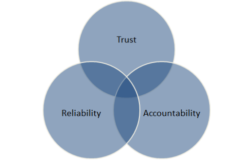
Visibility ensures that trust, reliability, and accountability exist in a team.
Diagrams are information radiators. They provide easy and legible access to progress information.
If your team, Scrum Master, Product Owner, or stakeholders cannot see what the team is doing, it creates the impression that you are doing lots of nothing. Or do lots of things completely wrong.
These doubts are one of the fastest ways to find yourself in a quagmire of unfinished work.
Making your work visible raises expectation, and luckily, it raises opinions of you.
The time wasted extracting progress status out of a teammate or following up on interdependent tasks will make you risk failing your sprint.
Working at a sustainable pace can only be achieved if you make proper use of the time available.
Your team and anyone else for that matter cannot trust someone who keeps progress hidden. They are in the dark, which leads to uncertainty. They tend to assume something is either being done or not being done and either get stuck into it themselves.
How reliable you are depends on how transparent you are about what you have taken responsibility for.
And how much your team can trust you to handle it to completion without causing stress to the team.
The agile community experiments with various approaches to visualize what is going on.
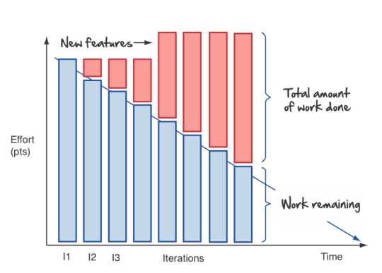
Burn-down and burn-up diagrams are available for sprints, epics, releases, and products. This is not a measure of work done but work which is still to be done. It is a valuable tool to use as a thermometer or symptom checker.
Flat-lining is a symptom of a few things:
-
You are working on too many stories at a time. You are doing lots of nothing, progress gets done very slowly. We recommend introducing WIP limits.
-
Your team hast too many started but unfinished stories at the end of the sprint. We recommend institutionalizing pair programming and mob programming.
-
Your tasks are not granular enough. Progress is slow and initial estimation does not reflect effective effort. One of the things which we tried is not to accept any six-hour tasks and on agreeing to decompose these tasks further.
Because of its appealing visual format, your team members can understand this chart easily. It is used to summarize a thorough description of a feature from an end-user perspective. That is why you can update the chart only after the completion of a user story.
- Sprint Burndown Chart
-
The sprint burndown charts depict how many stories are completed and how much work remains in the ongoing sprint. Sprint burndown chart displays user stories, which are selected by the team in the sprint planning session.
You measure finished stories providing value to the customer. You shall not track hours or task completion. - Product Burndown Chart
-
Product burndown charts can visualize the entire project; in short, it looks at the big picture. It shows how much work is remaining for your team to match the product goals. The vertical axis displays the product backlog items in the product burndown chart, while the horizontal axis implies the sprint numbers.
- Release Burndown Chart
-
This burndown chart is responsible for tracking all the progress made by your scrum team during reaching a release point. The vertical axis of the chart depicts the stories. The horizontal axis represents the time your team members spent.
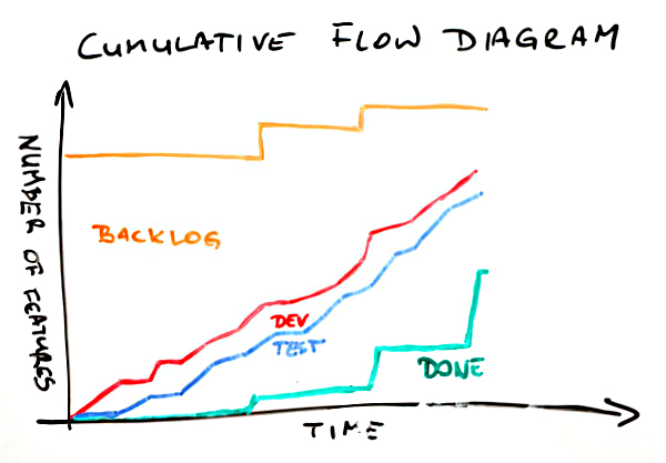
- Cumulative flow diagrams
-
The diagrams are available for sprints, epics, releases, and products. These diagrams show the bottlenecks due to team member specializations or dependencies to external actors.
Lean approaches request to identify and implement corrective measures to remove identified bottlenecks. - Velocity visualization
-
Business can envision and calculate when they can potentially release a product or subset of a product based on how fast the team is working. If the backlog has been estimated and refinement done properly, the number of story points it contains should be comparable to the velocity the team has been achieving sprint after sprint.
Remember estimation cannot be a single value. It must be a set of values with a success probability for each value. You did learn Gaussian curves during your school time.
An average velocity can be applied to the total of story points in the backlog. With this information, business can plan on tentative release dates.
Experienced teams sometimes use additional visual aids to improve effectivity:
-
Effective work effort per Sprint
-
Issues flow diagrams
-
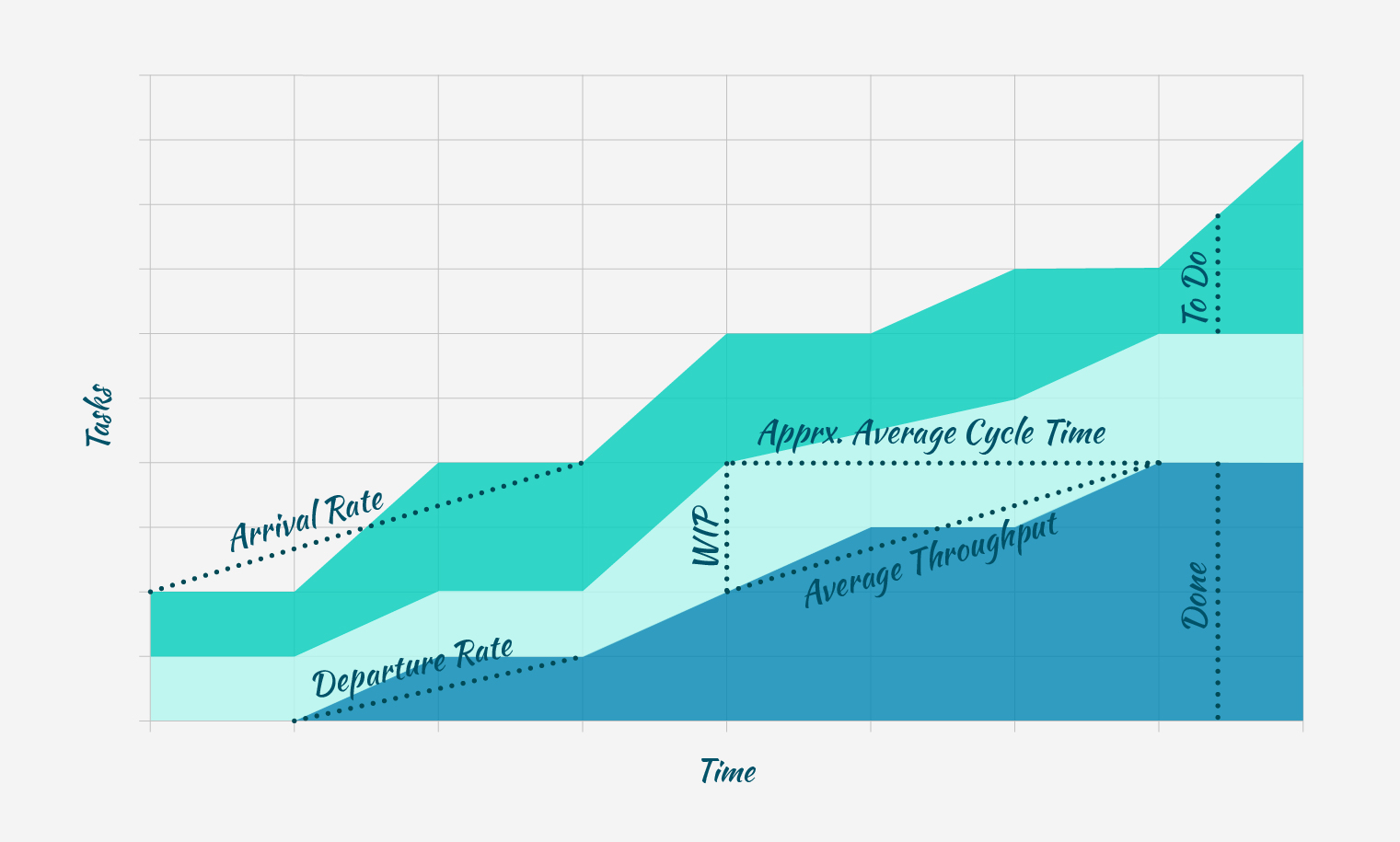
Cycle-time of stories or cycle-time of errors
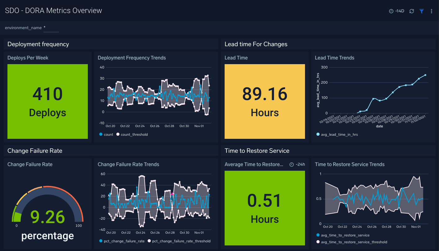
DevOps Visual Aids
DORA diagrams are similar visual aids focused on DevOps activities
-
Deployment frequency (DF).
-
Lead time for changes (LT), you can also compute the average age of issues and cumulative flow diagrams for issues.
-
Change failure rate (CFR).
-
Meantime to Recovery MTTR. Called time to restore service in the above dashboard.
GitHub Tools
GitHub is a web development platform inspired by your work style. It enables you to handle software development projects side-by-side with 40 million developers.
The main features are:
-
The tool features built-in review options for hosting code and review changes.
-
Integrate with apps you can find in GitHub Marketplace.
-
Coordinate tasks, stay tuned, and optimize output whatever the size of the team.
-
Write up comprehensive documents specifying all the awesome features of the software you develop.
-
Store all your code in one place. The platform with its 100+ million hosted projects provides repositories equipped with tools to help you host, version and release private, public, or open-source code.
The updated projects functions better support agile approaches such as Scrum or Kanban.
Various addons are available for more complex diagrams and visualizations. Start small, learn and adapt your development tools.
Lessons Learnt
Visual aids improve your understanding of your product state. They support teams to take improvements as a regular activity. PDCA is easier to implement with realtime visual checks.
Lean approaches strongly advocate visual aids to display process state and identify areas of improvements. Time-based diagrams show changes over time.
A picture is worth a thousand words. The visualization of facts often helps to identify improvement potential. The same diagrams measure the success of specific improvement measures. One well-documented successful approach is the four DORA metrics and associated graphs. Experienced teams can improve effectivity and efficiency with more advanced technique [1, 2, 3, 4]
Links
-
[1] Scrum Guide. Ken Schwaber and Jeff Sutherland. 2020.
-
[2] Introducing DevOps Ideas. Marcel Baumann. 2022.
References
[1] B. Beyer, C. Jones, J. Petoff, and N. R. Murphy, Site Reliability Engineering. O’Reilly Media, Inc., 2016 [Online]. Available: https://www.amazon.com/dp/1492029505
[2] G. Kim and N. Forsgren, DevOps Handbook, Second. IT Revolution Press, 2021 [Online]. Available: https://www.amazon.com//dp/B09G2GS39R
[3] A. Tornhill, Your Code as a Crime Scene. O’Reilly Media [Online]. Available: https://www.amazon.com/dp/1680500384
[4] A. Tornhill, Software Design X-Rays. Pragmatic Bookshelf [Online]. Available: https://www.amazon.com/dp/B07BVRLZ87